How Should Color Harmony Be in Web Design? - Hitit Media

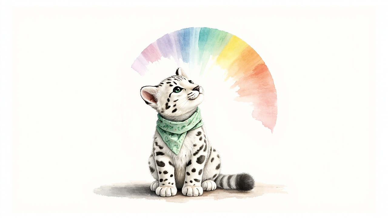
The Silent Language of Color
The moment you land on a website, a feeling forms inside you before you read a single word. Trust or coldness, energy or calm? What creates that feeling is rarely the typography or the text. It is the color filling the screen.
At Hitit Media we focus on engineering with real passion when we build sites with Next.js. But we also know that color has a language, a mathematics, and a deep imprint it leaves in people's minds. This article is the grammar of that language: with color codes, harmonious palettes and real examples.

30-SECOND SUMMARY
A good web palette is never chosen at random; it is born from relationships on the color wheel. One primary color, one secondary, one accent and a neutral skeleton (the 60-30-10 rule) create balance. Every color has a psychology: blue signals trust, green balance, red energy. But aesthetics alone are not enough; text and background must meet a WCAG 4.5:1 contrast ratio, and color blindness must be considered. Color is exactly where art and engineering meet.
Where Engineering Meets Art
Most conversations in web design revolve around performance, code quality and SEO. These are vital. But a large part of the impression a site makes in the first 50 milliseconds is set by color. Studies show people base a significant portion of their first judgment about a product on color alone.
Color holds a measurable engineering problem (contrast ratios, accessibility, consistency across screens) and an intuitive art problem (emotion, brand identity, balance) at the same time. For us, good design never separates the two. A pixel-perfect interface is incomplete unless it speaks the right color language.
The Psychology of Color: Every Color Has a Voice
Colors carry cultural and personal associations. Which color a brand chooses is directly tied to the emotion it wants to convey. Here are the most common web colors, their codes and the impressions they leave:
These associations are starting points, not absolute rules. A bank's blue and a children's brand's blue will never be the same tone. The secret is to choose the right color and then use it in the right tones and the right proportions.
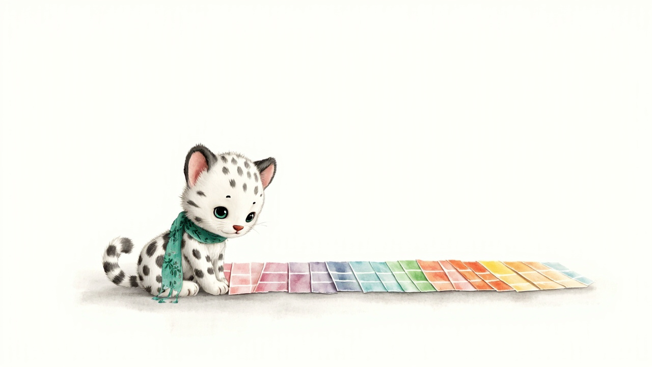
The Color Wheel and Harmony Schemes
The science of color harmony lives in the color wheel. The wheel orders colors by hue. Harmonious palettes come from specific geometric relationships on this wheel. Here are the six most-used schemes with color codes you can use right away:
1. Monochromatic (One Hue, Many Tones)
Light-to-dark tones of a single color. Extremely elegant, calm and hard to get wrong. Ideal for corporate and minimal sites.
2. Analogous (Neighboring Colors)
Colors sitting next to each other on the wheel. Common in nature (sunsets, forests), so they feel very comfortable to the eye. Calm and harmonious.
3. Complementary
Two colors directly opposite on the wheel. Maximum contrast and vibrancy. Perfect for lifting a CTA button off the background, but use it in balance over large areas.
4. Split-Complementary
A base color plus the two neighbors of its complement. It keeps the vibrancy of complementary but softens the tension. The safest "bold" scheme for beginners.
5. Triadic
Three evenly spaced colors that split the wheel into thirds. Vivid yet balanced. Usually one dominates and two act as accents. Great for creative, energetic brands.
6. Tetradic
A rich scheme made of two complementary pairs. The hardest to balance because it offers so many colors; pick one to dominate and let the rest support it.
The 60-30-10 Rule: The Formula of Balance
Borrowed from interior design, this golden ratio works in web design too. It splits a palette into three proportions and creates a balance the eye can roam without fatigue:
- 60
Dominant color (60%)
Usually a neutral: background and large areas. It sets the mood of the page.
→ A calm base like white, light gray or deep navy
- 30
Secondary color (30%)
Cards, sections, headings. Contrasts with the dominant color and builds hierarchy.
→ Your brand color or a tone of it
- 10
Accent color (10%)
Only in the most critical spots: CTA buttons, links, active states. Powerful because it is rare.
→ A vivid accent that grabs attention
Ready-to-Use Web Palettes
Let's turn theory into practice. Below are five palettes for different sectors and moods that you can use directly. Each has a primary, a secondary, an accent, a surface and a text color:
Corporate Trust · Finance, law, consulting
Natural & Fresh · Health, sustainability, technology (our spirit)
Premium Minimal · Luxury, fashion, portfolio
Warm & Inviting · Food, education, kids
Modern Tech · SaaS, AI, startup
Accessibility: Color Is Not Enough, Contrast Is Essential
This is the engineering side. No matter how stylish a palette is, it fails if the text cannot be read. WCAG (Web Content Accessibility Guidelines) defines the contrast ratio between text and background with clear numbers:
4.5:1
WCAG AA minimum contrast ratio for normal-size text.
WCAG 2.2 · 1.4.3
3:1
AA minimum for large text (18.66px+ bold / 24px+) and UI components.
WCAG 2.2 · 1.4.11
7:1
WCAG AAA target: highest readability for the widest audience.
WCAG 2.2 · 1.4.6
~8%
Red-green color blindness rate among men. Never rely on color alone.
Color blindness statistic
Seeing the difference is best. The two boxes below sit on the same green background: the light-gray text on the left barely passes AA, the dark text on the right passes comfortably.
Low contrast (hard to read)
Light text on light background: tiring on the eye, barely AA.
High contrast (clearly readable)
Dark text on light background: easy to read, near AAA.
Another golden rule: never put pure black (#000000) on pure white (#FFFFFF). That combination creates visual vibration and tires the eye over long reading. Use slightly softened tones like #0A0A0A and #FAFAFA instead; it reads more professionally and more comfortably.
The Most Common Color Mistakes
Giving each section a different vivid color turns the page into cacophony. Stick to 60-30-10; one accent color is enough.
Showing errors only in red and success only in green excludes color-blind users. Always pair color with an icon or text.
Light gray text looks minimal but cannot be read. Never trade accessibility for aesthetics.
A different color world on every page erodes trust. Color is the fastest-recognized part of brand identity; stay consistent.
At Hitit Media, Color and Code Work Together
For us, color is not an ornament the designer adds at the last minute; it is part of the architecture. In our Next.js projects we never hardcode colors one by one; we define them as design tokens and CSS variables. That way a single brand color change ripples consistently across the entire site in seconds. Light/dark theme support comes naturally from this structure.
Before any palette goes live, we run it through engineering: we test contrast ratios automatically and verify with color-blindness simulation (the Viénot model) that the palette stays readable for everyone. We never choose between aesthetics and accessibility, just as we never choose between speed and beauty. You can measure your own color harmony on your live site with our Design Audit tool.

Conclusion: Color Is Not a Preference, It Is a Decision
Color harmony is not luck. When the geometry of the color wheel, the intuition of psychology and the mathematics of accessibility come together, you get an interface that is both beautiful and functional. The right palette introduces your brand at a glance, builds trust, and guides users without tiring them.
Let's build your brand's color language with the same rigor we build your code: get in touch with us.
Test your color and design harmony in seconds
At Hitit Media we don't just talk about design, we measure it. Enter your live address; see color harmony, contrast, typography and technical quality instantly.
All tools are free, no signup required.
Sources and References
Live tool that generates harmony schemes (analogous, triadic, complementary) on the color wheel.
W3C's official standards and explanations for text-background contrast ratios.
A developer-focused guide for practical interface and color palette decisions.
A popular palette tool that generates and exports harmonious palettes in seconds.
Frequently Asked Questions
01How many colors should a website use?
The general rule is 60-30-10: one dominant (neutral) color, one secondary (brand) color and one accent color. Add neutral grays and a text color to these. More than three main colors creates clutter on most sites.
02Which color builds the most trust?
Blue and green are generally the most trust-building colors; blue is tied to corporate feel and technology, green to balance and nature. But the right color depends on your sector and audience: black may suit a luxury brand, while warm tones fit a children's brand.
03What is a HEX color code?
HEX defines a color in the form #RRGGBB. The first two digits set red, the middle two green, the last two blue, each from 00 to FF (0-255). For example #10B981 is the Hitit Media green. RGB and HSL notations are also used on the web.
04Why is contrast between text and background so important?
Insufficient contrast makes text unreadable, excludes users with low vision, and makes the site unusable in sunlight on mobile. WCAG requires at least 4.5:1 for normal text. Good contrast also contributes indirectly to SEO through accessibility and E-E-A-T signals.
05How should I choose my brand color?
Define your sector, your audience and the emotion you want to evoke. Choosing one strong brand color and building a neutral gray-white skeleton around it is the safest path. Generate light/dark tones of that color and test every combination for contrast. At Hitit Media we run this process with you, through both an aesthetic and an engineering lens.